Wednesday, 31 March 2010
Introduction
studio
People
Black and white
colour
work
land
Throughout this project I will be exploring a range of different materials to work with and researching photographers image making and agenda's to provide myself with influences to give myself inspiration into my own image making. Making this blog will give me a first guide to experiencing the use of the internet to present my images.
Tuesday, 30 March 2010
Environmental Portraits - Week 6

For this shot I wanted to work with the rectangle of the window to fit a shaped compostion with the subject in this frame to hold most of the focus. Knowing that the subjects vehicle was in view through the window I felt this gave more detail to the subjects occupation. I wanted to keep a wider shot for this image as the architectural lines of the room create an interest atmosphere into the frame.
I shot this image with an Olmypus OM1 with a 50mm prime lens on a ilford hp5 400 iso film.
Because I was working with no flash units I wanted to work with artificial constat lighting to maintain a good exposure, I did so with the plasterers harsh light aimed at the ceiling with a soft light filling the room.

I wanted to find natural shots for this shoot and understand the role of work in a plasterers job. Doing so I let him work and allow him to pretend I was'nt there to take photographs of him. Plastering involves concentrating and a alot of movement from place to place and this movement is something I wanted to capture.
Using the same camera, lens, film and lighting I capture this image.

The harsh lighting that became diffused once it had hit the ceiling cause a great attraction to the frame once the plasterer was working beside it. I felt to provide the image with an extreme patch of bleach white alongside a dark corner the tonal range creates an interesting mood for the composition of the subject.
As the lighting was closer to the subject a different exposure around the leg of the subject was revealed, however I kept the same lighting setup where it was.

Arnold Newman creates powerfully simple compositions within his frames, but remains to fill the audience with a great deal of interest into the subject. With this shot I wanted to provide the frame with a simple setting and use the subjects movement and stretch in his arm to enter the frame and release a powerful composition like Arnold Newmen.
Working with the same equipment and lighting setup the image allows a tiny highlight to hit the head of the subject, adding an interesting touch.

As I wanted to express five images that reveal the roles involved in the plasteres job, concentration plays a big part. I have taken a close up to show the interest between the subject and his coordination towards perfection. This connection between the two provide a locking focus on the subjects form. The compostion in the bending of the arm also interests me as it works well with the positioning of the subjects head looking at his hand.
In this shot the light is more diffused and causes a higher level of midtones, however there are smaller areas with patches of highlights. I used the same equipment to take this shot.
Monday, 29 March 2010
My chosen Image
Nationality - German
Photography genre - Fashion/Portraiture
Image title - French ''Vogue'', Paris 1975
Image taken - In Rue Abriots, Paris 1975
Purpose - French Vogue 1975

http://www.designboom.com/history/helmutnewton.html - ‘With the aim of freeing women from the trappings of feminine, frilly dresses, he caused an almighty scandal’.
In my chosen Image a female model is stood centre frame turned slightly to her left. She is wearing a masculine suit with her left hand in her pocket and her right hand holding a cigarette. She is looking down at the pavement out of the frame with tied back hair. The model is located on the street of ‘Rue Abriots’ in Paris. On either side of the subject there are attached buildings down the street with lamps also. A lamp just in front of her which isn’t in shot is acting as a light source on the model.
During the late 20th century women of the world’s cultures were fighting against the government for their rights to gain equality to men and have their vote in politics. This conspiracy for women to gain more power caused many rivalries due to the countless protests. German fashion photographer Helmut Newton found his agenda had always been fascinated playing with masculinity and femininity. His work became very popular during the late 20th century as his photographic meanings were identical to the movement of women in world politics. My chosen image was taken for a magazine in Rue Abriots, Paris for ‘French Vogue 1975’; he had shot his female model expressing a masculine form within her female body using fashion to force a strong narrative into the frame.
Newton was quoted by photography encyclopedia as a ‘fashion photographer whose vision of an aggressively confident and predatory form of female sexuality dominated the last third of the 20th century’. With the movement in women’s politics this allowed the fashion industry to feed off the world’s environment as a source for inspiration. With this great inspiration that had become available to Helmut Newton, his 1975 ‘French Vogue’ shot was said that he captured an image that had changed fashion.
The late 20th century of Newton’s work was said to be the pinnacle of his urban erotic style. The impact that fled from his photograph in the streets of Paris for vogue 1975 had moved fashion in a direction of new styles and influences and we can therefore question whether fashion would be the same today without his input.
Sunday, 28 March 2010
Inspiration to Week 5
Kynance Cove

Image title - Landscape at High Tide
When I came to do this shoot at Kynance the tide was nearly at its highest and this cove looks completely different from low to high tide. So I captured this to reveal the vast domination of the sea against the cove. The weather conditions can create a fierce sea around where this cove is located in 'The Lizard' and with this Wide shot of Kynance I managed fill the frame with a varying range of blues in the sea and textures in the rocks/headlands.
With this shot I used my DSLR Nikon D80 with a 17-70mm zoom Sigma lens to get a wide shot. I was shooting with a fairly quick shutter to prevent any blur in the water with a mid ranged aperture. I wanted to create a painted effect within my image so I worked with levels and saturation to push this style. To get such a high shot looking down on to Kynance cove I had to get up to a high peak on the other headland to the cove.

Image title - Scale
When I was stood on the peak of a headland I could see the whole of the cove filled with its high tide. Huge rocks sit in the water at high tide around the headlands of Kynance and I wanted to show just how big the scale of these rocks are with the size of the people standing on the headland. The image is very dramatic as the large agressive sea creates this vunerability to the people on the headland.
To take this shot I used a bigger lens to get a closer shot, this was a 70-300mm Sigma zoom lens. I placed the composition of the people on the right middle side of the frame to strengthen to dramatic sense of vunerability in the people against the large scales of the rocks and sea.
 Image title - Choppy
The Lizard is known for its choppy sea conditions and the day I went to do this shoot at Kynance there was an extremely choppy sea in the cove. With this shot I felt that the jaggered rocks fitted the texture and form of the crashing wave as it enters the left side of the frame. The frame is filled with an aggresive emotion however the pools of light hitting the jaggered rocks alongside the bleached white tips of the waves express a beauty.
To get a fairly close shot on this image I used the same lens as I did with the last image and had to zoom in a lot. It took a while to capture this image as I had to get the right composition of the wave to the rocks and waiting for waves to come in where I wanted them too proved to be a waiting game. I cropped the image to force a better focus on the wave and rocks which provided the frame with a more dramatic shot.

Kynance cove is full of small and large enclosed and opened pools where the sea can flood into. One of my favourite places to see powerful white water is on the left side of the cove because when the waves are big and strong enough there is a gap that waves can smash through and this is a shot of the wave bursting through the gap. I feel that the white water pushing through the dark rocks create a good contrast. The bursting water allows the frame to provide shapes and form in the water which increase strength in this dramatic action shot.
 Image title - Contrasting colours
Kynance is full of wonderful and interesting sites and has a beatiful range of colourful rocks. I wanted to provide one of my five images with an example of this. The water flowing down the rocks provides a small depth in the image. In the shot a range of textures and tones spill into the frame from the rocks with glowing green seaweed scattered randomly. I find this random assortment creates and interesting composition in the picture with a colourful contrast.
To take this shot I used a fairly wide lens zoomed in. I positioned myself alongside this flowing water to create an interesting compositon. I also cropped the image to hold a concentration on the contrasting colours and flowing water. Using levels in post productions heightened any low colours forward.
Wednesday, 17 March 2010
Inspirations to Week 4
Smart Fashion / Portraiture
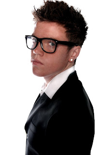 Image title - Business
In this shot I wanted to express a serious and dramatic mood from the eyes with the angle and position of the head forming a strong composition centre frame. I wanted the subjects body to be shot side on so the light can create a smooth texture on the jacket and collar of the shirt. Using this positioning on the subject has allowed me to create a soft light effect on himself and with the peircing eyes the frame forms a dramatic touch.
To make this image I used a high key studio to relate to the sharp, fresh and edgy relationship between the clothes and the white background. To light my subject I used a large soft box directly infront of my model, aiming down on to him from a high level he was lit up on an aperture of F8. To keep a clean white backdrop I used flags to prevent any leaking light from the main flash unit, two flash units aiming at the backdrop providing an aperture of F16. During this Shoot I was using my DSLR Nikon D80, with a 17-70mm Sigma zoom lens.
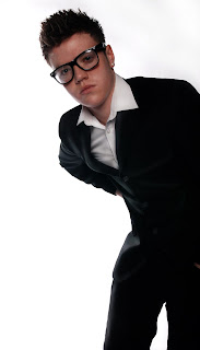
Image title - Entering Frame
For this shot I wanted to provide the frame with this curious laid back attention from the subject. With the glasses being warn it allows the subject to create this inquisitive approach in his composition as he enters the frame from the right side. As the subject leans into the frame it produces a beautiful tone of light causing texture onto the jacket and shirt, allowing the clothes to become more attractive.
To make this image I used worked with the same lighting techniques, DSLR and lens. To create this composition I took the picture with him entering the frame, however to tighten the shot more so I cropped the above and left side of the frame, bringing it in closer to the subject.
In this shot I wanted to perform a great deal of relaxation with this smart outfit to provide the frame with a chilled out stylish look. I wanted to capture my model lying down to enforce this approach, but to mix up my composition I went for a triangular positioning of my subject. I feel that this composition holds what I'm trying to express within my subjects pose clearly, allowing the clothes to stand out in different sections of the frame.
Within this shot I use the same lighting set up, along with the same camera and lens. It was fairly challenging fitting my subject into the shot for this pose he was creating, this therefore gave me little room to work with. However at the angle I captured I managed to get great results from the lighting along the whole of the body.
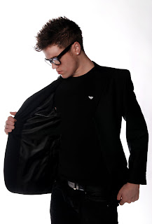 Image title - Opening Jacket
Within the frame of 'Opening Jacket' I wanted to hold a great concentration on the texture and style of the jacket being worn and the jacket itself. To perform an interesting centre frame of composition I had my subject looking past his hand to attract awareness to the gripping and opening of the jacket. The jacket being opened also provides shape in the frame, creating a dramatic pose on the model.
To make this image I used all the same equipment and lighting set up. To capture the right amount of light on the jacket I had my model stand fairly close to myself, so I had control over the composition I wanted to capture. I kept the lighting straight infront of my subject to hold the lighting on the jacket to create a more powerful appearance. To hold a better focus on the subject I brought in the sides of the frame using the crop tool in post production.
Saturday, 13 March 2010
Inspirations to Week 3
Hip Hop Fashion / Portraiture
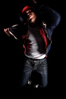 Image title - Jump
In this image I wanted to express movement in my subject to emphasise dance in Hip Hop. With this fairly close shot the subject creates strength in his form with a high jump in the air. This strength helps to power the energy in hip hop I'm trying to release. Keeping the light on each hand allows the clothes to be seen being held and stretching the hoodie out and slightly lifting the hat creates a more fluid action. The bent knees help to keep the body straight with a simple but effective centre frame composition.
To create this image I had to take the image at a fairly high level to make sure I could be at the same height as my subject once the shutter was released, so I used a stool to stand on to capture the image. I had to be careful with my lighting to make sure it leaked on to the face as this is what I wanted so I had to make my flash unit high camera right. I was using a Nikon D80 for this with a 17-70mm Sigma zoom lens.
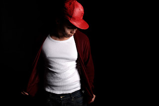
Image title - Opened Cardigan
I wanted to capture a knitwear jumper that went well with the red leather flat peak cap as I knew it would go well with this style of Hip Hop. The white vest matches well with the cardigan and the dark blue jeans. I wanted the subject to hold the cardigan open so the light can spill on to the vest and create a varied range of tones. With the head tilting downwards towards the flash unit the hat is provided with a beautiful source of light. As the male subjects left shoulder enters darkness the light creates a powerful effect on the rest of his clothes as it looks like he's stepping into the light.
To make this image I had my model walk backwards and forwards opening his cardigan so I could capture his movement and find the best lighting on his body once he was infront of the light. Because Hip Hop isn't just a fashion style but a music genre this movement technique in my shoot became very interesting as I wanted to link his movement with Hip Hop. I left the right side of the image blank as it feels more effective as the subject is looking into space with the light on his face, so this image is left uncropped. I used the same camera and same lens in this shot but held my camera landscape as I felt it would work better with the subject opening his jumper wider.
I became fascinated with how well the light was falling on to the hat during the shoot and decided to capture a close up shot of the subect to show the texture on the cap. This Hip Hop shot reveals a serious expression on the face and a sense of confidence in the subjects style. I wanted the hand holding the end of the cap with the head faced up towards the light to create a powerful lighting effect, producing a clear view of both the face and the hand. The left eye being lit gives a dramatic dominance in the image enforcing strength in the subject's form.
To capture this composition I had my subject sat down with his hand holding his knee and this allowed the right of his jumper to stick out in view of the camera. From the original image, the left eye had a small amount of light leaking on to it but I strengthened that by dodging it in post production. Keeping the light high camera right allowed me to gain more experience in understand how the light would act on my subject so I kept the light there using the same DSLR camera and Sigma lens.
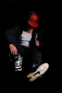 Image title - Chillin'
In this shot I wanted to create this laid back relaxed look but with a dramatic mysterious feel. The head tilted down and not being visable provides this mysterious look and creates a better focus on the clothes being worn. To create an interesting composition I positioned the subject sat down with his leg extended to form a triangular shape. The sat down approach helps to provide the subject with a more casual look and relaxes the frame with a black border around him.
To make this image I went low to the floor to get down to the level of my subject. I had the light falling down on the the right of the subject with a high camera right flash unit. I used the same DSLR and lens. Using dodging and burning in photoshop I brought out textures of the hoodie, cap and jeans.
 Image title - Swagger
This portrait angle shot creates a confidence in the subjects style. His tilted head creates a beautfiul pool of light around the hat and face. With the opening of the jumper the subject emphasises his casual and cool look. The vest provides the model with a masculine touch, giving a powerful effect with the navy jumper. The centre frame composition pushes the subject forwards into the frame, wrapping a depth of field around the model and enforces his proud expression in this shot.
To make this shot I had my subject walk backwards and forwards, similar to the shot with the caridgan, however I asked him to look straight into the camera with a lowered head. This allowed the light to become more powerfully interesting as it fell on the subject. Using the same camera and lens I stood the slightly lower than the subject to create a higher level of dominence over the subject in the frame.
Inspirations to Week 2
These magazines are, Vogue, I-D, Dazed and Confused and Harpers Bazaar.
These magazines first inspired me to do this for a shoot, but once thinking about the shoot I felt that I wanted to go deeper into this idea of using military for my 5 final shots. I want to find emotions behind what happens in warfare and how it effects us and others around us. How ever I also want to add some variation to this shoot and have some shots capturing an erotic sense and these will play around with masculine and feminine. I like the idea of playing around with masculine and feminine senses in my image making and using a female model will create an interesting effect with rough and ragged military clothes.
Feminine Militance
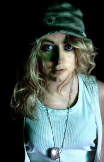 Image title - War Child
In this image I wanted to release this sense of innocence in the subject to enforce the frame with negative expressions that link to children in areas of warfare today. The staring eyes into the camera provides the frame with a terrified feel in the subject. The focus on the face allows the image to have this distant feel within it and therefore produces this mood of loneliness to be seen. With the camera aiming down in the picture, it emphasises dominance over the female subject, I did this to show a weak emotion that innocent children in areas of conflict suffer from.
To make this image I used a low key set studio with one flash unit high camera right. I used a Nikon D80 with a fairly closely zoomed sigma 17-70mm lens. To get the extra bit of height above the subject I used a stool to stand on to provide this sense of dominence I wanted over the subject. To get the interesting green effect around the left side of the subjects face I placed a sheet of green transparent plastic over the soft box. Having the soft box high camera right allowed the subjects nose shadow to begin to follow her cheek bone and give a subtle shadowed effect also for her chin and top lip. I cropped the sides and above of the image to bring the focus tighter in on the subjects face to create a more dramatic look.
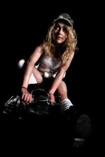
Image title - Dirty Boots
In this image I wanted to capture the real life task of a soldier cleaning their boots however, I used the subject sitting down in this pose with her looking up to let the light hit her face in this way. I wanted to get this interesting light on the face to make it look mysterious and dramatic. The expression on her face reveals this emotion of intimidation, I wanted to provide this as I wanted to link it with her responability in her job. The lighting is like a spotlight effect as she is the only thing lit up and the dark low key studio allows the audience to view this female subject stood out in the frame.
To make this image I used the same DSLR camera with the same sigma lens and low key studio. The lighting was still placed high camera right but once the subject was sat down, the light began to create an interesting spotlight effect. To impove this lighting effect I darkened around the subject in post production. To create a greater focus on the subject I had her positioned like this to create a triangular composition in her form. I didn't want to crop this image as the black space surrounding her provides the subject with a feel of isolation and as mentioned earlier intimidation.
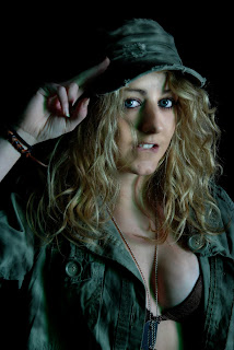
Image title- Salute
When working on this shoot I wanted to reveal some emotions from the effect warfare has. However I was first going to use this opportunity in using the studio to create a set of fashion shots. Instead I've used some shots to express this erotic sense to a woman in the military and with this I wanted to expand apon this idea of masculine and feminine in the image as the military first feels like a masculine aspect, but with out being too sexist I wanted to reveal this sexy feminine approach to the military outfit. To give this erotic look I used the jacket to reveal the subjects chest with the dog tags falling through the cleavage. With the subjects eyes making contact with the camera and the teeth biting the bottom lip it's created this sexual form in the frame.
With this shot it involved using the same camera and lens along with the same lighting set up and studio set up. However to get this close-up shot I stood away from the subject and zoomed in to get the right composition I was looking for. To get a more interesting effect on the jacket I used dodging and burning tools in post production and this allowed the jacket to create more of a textured feel.
 Image title - Falling hair
This image is fairly simular to the last as I am trying to feed the frame with the same idea, however with this I wanted to created this contrasty look on the hair when it falls down on to the shoulders once the hat is lifted off the head. There is a bit more length and depth in this frame and this helps to give a wider shot on the subject to reveal this sexual look. The lighting high camera right keeps this contrast around the hair and jacket and allows the chest to be evenly lit.
To make this image I had my subject turned slightly to the right to have the soft light fall evenly on to herself. However I made my subject stand fairly close to the light so the soft light almost became hard. To get this tighter focus on the subject I brought in the sides and the top and bottom of the frame to keep a strong focus on the subject. In post production I also used dodging and burning to get rid of any blemishes and also using the patch tool to do so. With any high saturation areas I used the sponge and to get the high contrast I worked with levels.
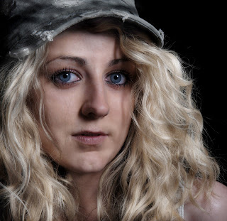
Image title - Close up
I wanted to get a close up shot of the face to reveal part of the hat and the feminine hair falling on to the shoulders. This is more of a positive image as the subjects face is warm and with the blonde curly hair dangling down in a shiny tint from the light the frame becomes happy. I wanted to capture this close up shot as I wanted to capture this happiness from the subject and the hair looked beautiful once closely shot. I feel that the skin tones works evenly with the colour tones of the hair and creates a nice contrast between the golden blonde hair and the green military cap.
To make this shot I used the same DSLR as I did for all five shots and using the same lens I came in close to the subject. To get a tighter shot I brought in the top and the sides of the frames to focus more so on the hair and face. The dodging tool helped to bring out any dark patches in the hair to create a lighter golden effect. As the flash unit remained high camera right this allowed my subject to stand fairly close to it and have a nicely lit upper body.
Thursday, 4 March 2010
Inspirations to Week 1
My identity project is all about pressures within ourselves to become who we are and not pretend to be someone we're not. I've taken these pictures to show emotions and how they effect our lives. I find Nelson's work highly influential as he too is looking at the meaning to people trying to become happier in themselves however he looks at more of the appearance side to people, but this inspired me to see how emotions in our personality are just as important to view.
Rankin made a whole project called Alex Box using makeup designs to create a varied approach on identities using a range of vivid to sublte colours. Reviewing the Alex Box project has given me a deeper insite on the use of makeup when portraying a meaning to an identity, this has allowed me to work with this concept to link in with mine. With my obsession into fashion and beauty I've become greatly inspired to reveal my subjects emotions and with the use of different lighting techniques I feel Rankin's work has linked to mine.
My Torso image was influenced from the form of male greek statues, I found the form to be heroic and created strength and my torso image reveals this sense of strength to fight through weaknesses in an identity. Using this sense of strength and greek statues I became inspired to create a natural image to provide the frame with this look and feel.
Tuesday, 2 March 2010
Rankin's Alex Box Remade
Wednesday, 24 February 2010
Masculine Identity

In this image I wanted to produce this powerful glare into the camera to create this strong confidence to flood into the frame. His hands locked together on his head accentuate this force of stress pushing his identity away from others, but with this deep trancing stare he wants to reveal his personality.

Image title - Torso
For this image I became inspired by the strong heroic statues of masculine greeks. To reveal this I set the main focus of the frame to attract attention to the muscular torso. However I've used the subjects head position to emphasise this great movement of anxiety in the image. I wanted to stress the fact his head is looking down to dramatise his lonely personality, but his masculine body provides him with strength to fight through his weaknesses.
Feminine Identity

